While exploring ways to engage with our readers, we've spent considerable time contemplating applicable materials and topics. During our discussions, we realized that everyone can contribute to within their respective fields by sharing ideas and experiences. This led to the idea of unveiling our creative process and providing a glimpse behind the scenes, revealing not just the result but also the journey.
Microsoft Office UX is the first project whose process we'd like to break down in more detail. In 2021, the brand's design team invited us to create a short film that would showcase the updated design of the Office apps. Our task was to illustrate the most important features, including laconic app icons, a new material called Mica, and collaborative functions. But, the most important thing was to blend these parts and lead the viewer through the whole film. So, let's talk about the environment, as it was essential in telling the story of the next chapter of Office.
What was the underlying concept behind the building of the environment? The main idea was to demonstrate how the external world reflects internal changes. The objects of the "outside" mirror the patterns of movement and impulses transmitted "inside", unfolding in the same sequence. Sliding and ballooning, interior objects inherit the narrative of interfaces where icons interact similarly.
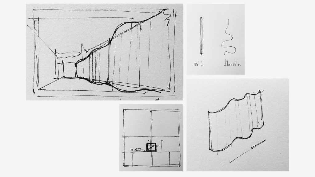
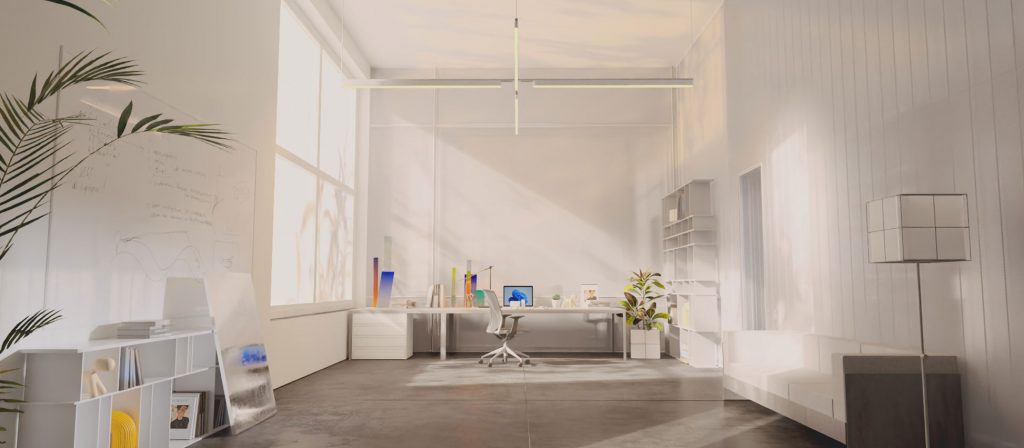
Well, it seems that we got a bit ahead of ourselves and missed the fundamental things — form, lines, scale, and volume. When crafting a volumetric geometric space, we aimed for minimalism, while avoiding a sense of confinement.
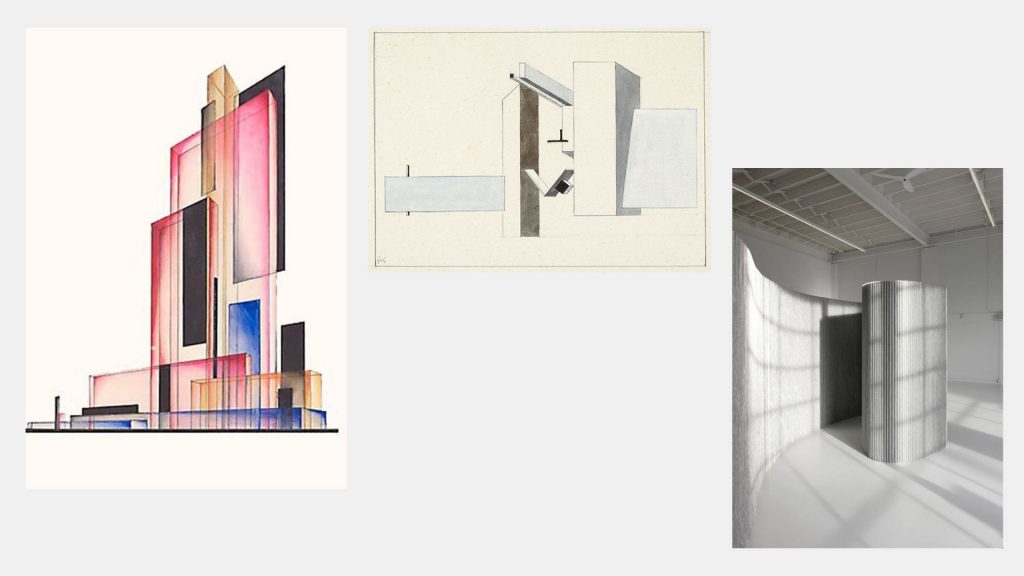
Drawing inspiration from architectural and graphic greats like El Lissitzky and Yakov Chernikhov, we followed the constructivist path, creating a functional space characterized by slender lines and forms.
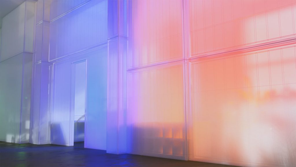
To maintain volume and expand the space visually, we employed translucent frosted materials that didn't constrict but rather encouraged exploration beyond the suggested boundaries. Layering this material effectively added depth to the frame.
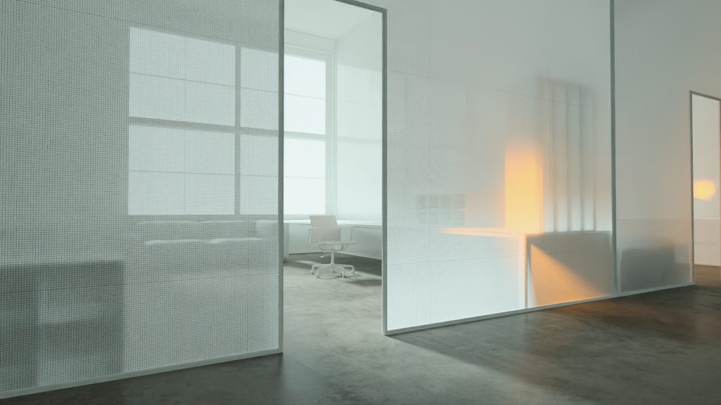
In a direct interplay of material and color, we tried to achieve a soft and flowing gradient effect that, at the same time, enlivened the space we built. Matched to the tone of the Office's main apps, the colors consistently float through the translucent wall material that keeps the dynamics and overall brand feeling.
Light is another crucial element of the space within the frame. Linked to the movement, it is a guiding element and emphasizes the interaction between the subjects. For example, slipping along the wall, the light accelerates the lamp, which adds a playful and dynamic release to the visual sequence:
Inheriting the contemporary art direction of Light and Space, we focused on the interplay between materials and light. Playing with illumination using translucent and reflective materials, we tried to expand the limits of the proposed space.
Turning to the interior solutions, you could see they drew inspiration from the Windows 11 design language. Guiding lines on the floor and walls, patterns on the lamp, and various elements served as constant reminders, immersing viewers in the brand's distinctive universe.
This was just the beginning of our dive into the story of creating the Microsoft Office 11 film. In upcoming chapters, we'll talk not only about the external environment, but also about the intricate interfaces, unveiling what happens inside the computer.